Design trends are reactions to technological and cultural changes. Product creators follow design trends for a reason — incorporating newer design trends into a product’s design can make the product look fresh and desirable to the target audience, and this creates a substantial competitive advantage.
But the problem with design trends is that they come and go, and it can be hard to know which trend to follow. An incorrect decision can cause a lot of problems. Just imagine that you’ve put a lot of time and effort into incorporating a particular style into your brand guidelines, only to discover that this style is now obsolete.
Now, when it’s almost the end of the year, it’s time to make an educated guess on what we will see in 2020. In this article, I’ve summarized the top 12 most powerful design trends that will dominate in 2020 and beyond.
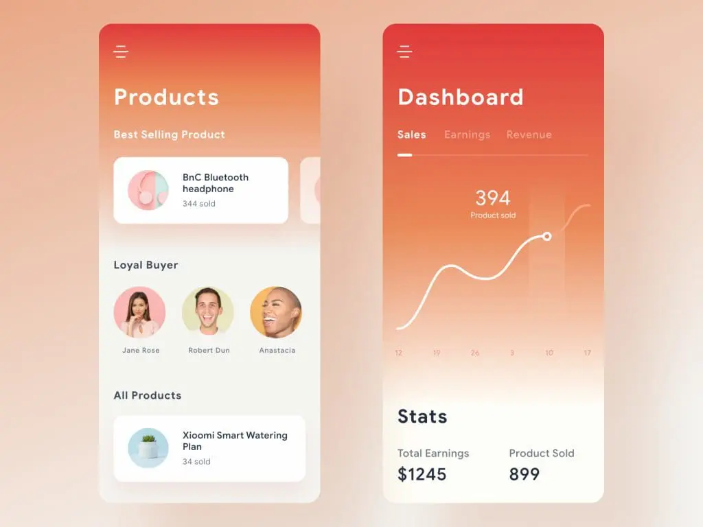
1. Gradients 2.0
Ultra minimalism dominated product design for a long time. Designers strived to reduce all visual properties and leave only essential objects such as key content and functional elements. As a result, they created products that used exaggerated amounts of white space and practically no color. Ultra minimalism made all interfaces look similar.
Users got bored with dull designs, and designers started to experiment with various visual styles. One particular style that found itself in the spotlight — gradients. In 2018 and 2019, gradients started to replace the flat colors. Gradients add some depth in flat layouts and make them more visually interesting. Both product teams and stakeholders love gradients because branding colors could be used to create them.
Gradients are a versatile tool. They can be used in various contexts such as a background for content, as color filters over the images or illustrations, or as an accent for functional elements such as the call to action buttons.

Gradients look equally good on the large screen of TV or desktop and a small display of mobile devices.

But compared to the gradients used by designers in previous years, the new generation of gradients has different styling. Gradients 2.0 can be subtle (created using muted colors) or loud (created using vibrant colors), but in both cases, they are relatively simple, using a single clear light source and created using one or two colors.
2. Abstract illustrations
It’s a well-known fact that using a custom illustration style is an excellent way to make a brand stand out. Genuine illustrations are part of a product or brand DNA. Competitors can copy your color scheme or typography, but not your illustration style.
Digital illustrations have taken center stage over the past few years. In 2019 we saw a boom of illustrations. All large companies introduced illustrations in their visual language. Here just a few honorable mentions:
- Shopify

- Mailchimp


But recently, it has become apparent that illustrations don’t have the same eye-catching power that they did before. With so many illustration styles around, it becomes hard for the users to match a particular style to a specific company.
In an attempt to make illustrations more effective, designers started to embrace more abstract illustrations styles, and this style will dominate in 2020.

However, there is an important thing that designers should remember when working on abstract graphics. It’s vital to make sure that your audience can interpret what you are trying to say. Illustrations that are too abstract won’t have much business value, and they will be more like a work of art rather than a functional element that serves a specific business purpose.
3. Bold fonts
If you visit the websites of industry leaders, you might notice that the headline, not imagery, is the first thing that grabs your attention. Hero headlines aren’t a new trend at all. But the interesting thing is the way those headlines are designed. Have you noticed that many of those headlines are designed with large bold fonts? Heavy fonts put more visual weight to the message and direct the reader to where they should look first. From an aesthetic point of view, bold fonts also give designs a modern and contemporary feel.

With the release of Apple iOS 13, bold headlines become an integral part of iOS apps. If we evaluate this design decision in terms of usability, it will be clear that heavy fonts are great for creating contrast (which improves text readability) and visual hierarchy of elements (which improves content comprehension). That’s why bold fonts are so popular among mobile designers.

At the same time, when using any heavy or bold font, it’s vital not overuse it. Here are a few things that you need to take into account:
Bold typography can be a little overwhelming when there’s a lot of it to read. If everything is bold, then nothing is bold. That’s why you should try to use these bold fonts only for short pieces of text or headers/subheaders.
Don’t forget about the contrast — a heavy font will have more impact when contrasted against a neutral background.
Use simple fonts. When it comes to text elements, the first thought should always be readability. It’s recommended to use Sans Serif fonts because they scale well. Also, when picking a bold sans-serif font, look for letters with round shape.
4. Geometric Shapes
Geometric shapes are a simple yet powerful asset that allows designers to create more appealing visual compositions. Commonly, geometric shapes are used to create visual dividers between sections.

But in 2019, designers started to find more interesting ways to use geometric objects. Many product teams use geometric shapes to convey a specific feel. For example, soft geometric shapes can help create a futuristic look:

While sharp lines and edges can convey a brutalist feel:

This trend works well with other visual design trends, such as gradients and bold fonts.
If you’re considering adding geometric shapes in your design and looking for inspiration, you can find perfect shapes in nature.


5. Emotional design
Design is communication. When we think about communication, we naturally think about delivering and receiving information. But there is one aspect of communication that can easily be missed — emotions. For a long time, product teams were focussed on creating great usability. But today, the focus has shifted towards great usability and the right emotional impact. Companies are quickly moving from neutral design towards a design that has an emotional impact.
Designers have a lot of tools in their toolbox that allows them to create more emotional interactions. For example, you can bake some humor in a design:

Or you could utilize simple animated effects to create delightful micro-interactions.
Reaction on user input by Darin Senneff
6. Data visualization
Humans are visual creatures. For many people, it’s easier to comprehend the information when it’s provided visually, rather than in text. Data visualization is quickly becoming an essential tool for creating visually engaging stories. The stories, like the one you see below, can captivate your audience and make them want to learn more about your brand.
A strong part of data visualization is visual storytelling and data art and illustration. Image: https://eng.uber.com/data-viz-intel/
7. Hero Video Headers
“Show, don’t tell” is a foundational principle of good product design. Imagery plays a crucial role in visual design because it helps the designers to deliver the main idea quickly.
For a long time, web designers have had to use static imagery to convey their main idea. But the situation has changed. High-speed connections make it much easier for web designers to turn their home pages into immersive movie-style experiences. That’s why in 2019, we’ve seen more and more websites that use short video clips on their home pages.
Video makes the experience more live and dynamic. It engages users, and they are more willing to spend time watching clips. Video clips used in a hero section can vary from a few seconds of looped video to full-length preview clips with audio.
8. 3D and Faux-3D Design
For a long time, 3D objects were only used in games and entertainment. With the rise of device processing power, we have 3D objects emerging on regular websites both on desktop and mobile versions. By introducing 3D objects and pseudo-3D objects in web experience, you add realism to interactions.

9. Scroll-Generated Websites
The power of modern technologies can help us create a lot more than just web experience — they allow us to create immersive visual journeys for our visitors. Scroll-generated websites track the user’s progress as they scroll the page and show contextually-relevant information. Scroll-generated websites use the power of motion and animation effects to capture user attention and introduce dynamism in user interactions. Those effects add an extra layer of meaning into existing content and make it more memorable for users.

10. Dark UI
You may have noticed that some of the largest companies are adding light and dark modes to their products. A dark mode is a low-light user interface that displays mostly dark surfaces. Embracing the dual-colored design trend has two significant benefits to user experience: dark themes help to reduce eye strain by adjusting the brightness of the screen to current lighting conditions, and they conserve the battery power of mobile devices by reducing the use of light pixels.

If you’re working on dark theme design, be sure to check Material Design guidelines that contain practical recommendations on how to design a dark theme for your product.
11. Better Personalization
The ideology of “one-size-fits-all” does not work for 2019 users. Brands are seeking for ways to fine-tune the user experience as meticulously as possible, and a personalized experience has quickly moved from a “nice-to-have” to a “must-have.”
SoundCloud is a music service that considers the preferences of its users and suggests the music that they like. The services do it based on the music you play and tracks you like.

With the rise of machine learning and artificial intelligence, it’s becoming much easier to make the user experience more personal.

12. Design Systems
Modern product design is all about speed and quality. Product teams should move fast without losing the quality along the way. Taking into account the fact that a single product usually should be released on multiple platforms, it can be hard to achieve this goal. Design systems are the answer to the scaling needs of the product team.
In 2019, more teams are starting to incorporate a systematic approach to design. While design systems are not a web design trend, they have a significant impact on web design. Thanks to design systems, product teams can reduce repetitive work and, even more important, achieve consistency across all platforms they design for.
Design system. Image: Justin Reyna.
Conclusion
Some of the trends you read in this article will be familiar to you, and some might be completely new. But don’t rush to implement all those trends in your products.
No matter how impressive the trends seem to be, it’s important to remember that the mission of the designer should always stay the same: help users achieve their goals by creating more usable products. That’s why fashion should never trump usability. It’s vital to evaluate every trend and implement only solutions that create a better user experience for your users.

ABOUT THE AUTHOR
Nick Babich is a developer, tech enthusiast, and UX lover. He has spent the last 10 years working in the software industry with a specialized focus on development. He counts advertising, psychology, and cinema among his myriad interests.


